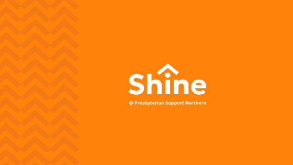
Shine has refreshed its brand logo and colour to give us a more modern and contemporary look.
The change will be rolled out across our website and social media channels, and overtime to our brochures and other collaterals.
After conducting research and seeking feedback from a range of stakeholders, we’ve worked with an external brand agency to come up with the new look. The research indicated that our brand should be more modern, look more unified and reflect our value of tangata whenua more.
Shine is about whānau being safe under their and our roof and you can see this represented in the whare symbol. The upward arrow shape also feels positive.
We also have a new aramoana kōwhaiwhai, which symbolises a pathway to the sea leading to new destinations. The refresh includes a fresher, more modern orange colour.
Our sister brands under the parent Presbyterian Support Northern brand have also been refreshed with a new look and feel, as well as new graphical elements and symbols. These can be seen at the bottom of the website page.